Spotify Redesign
Graphic Design
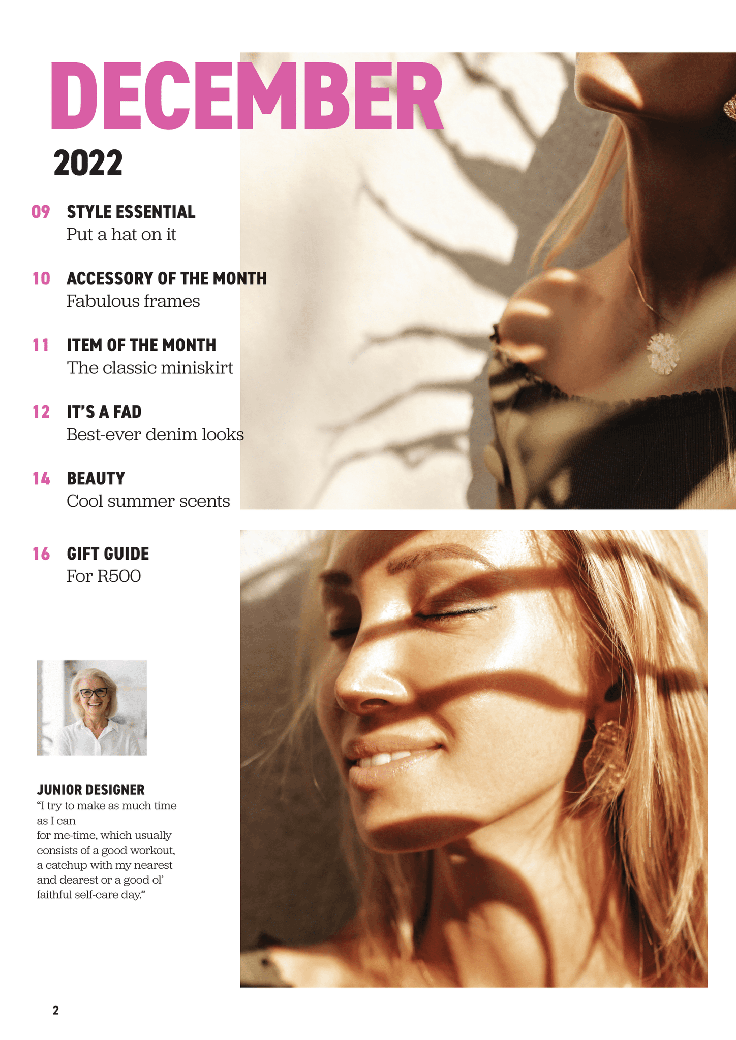
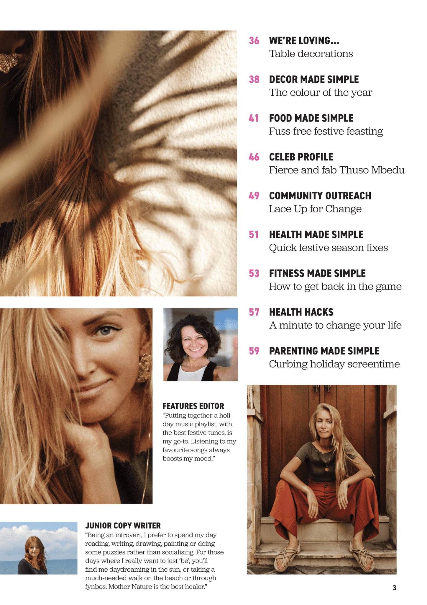
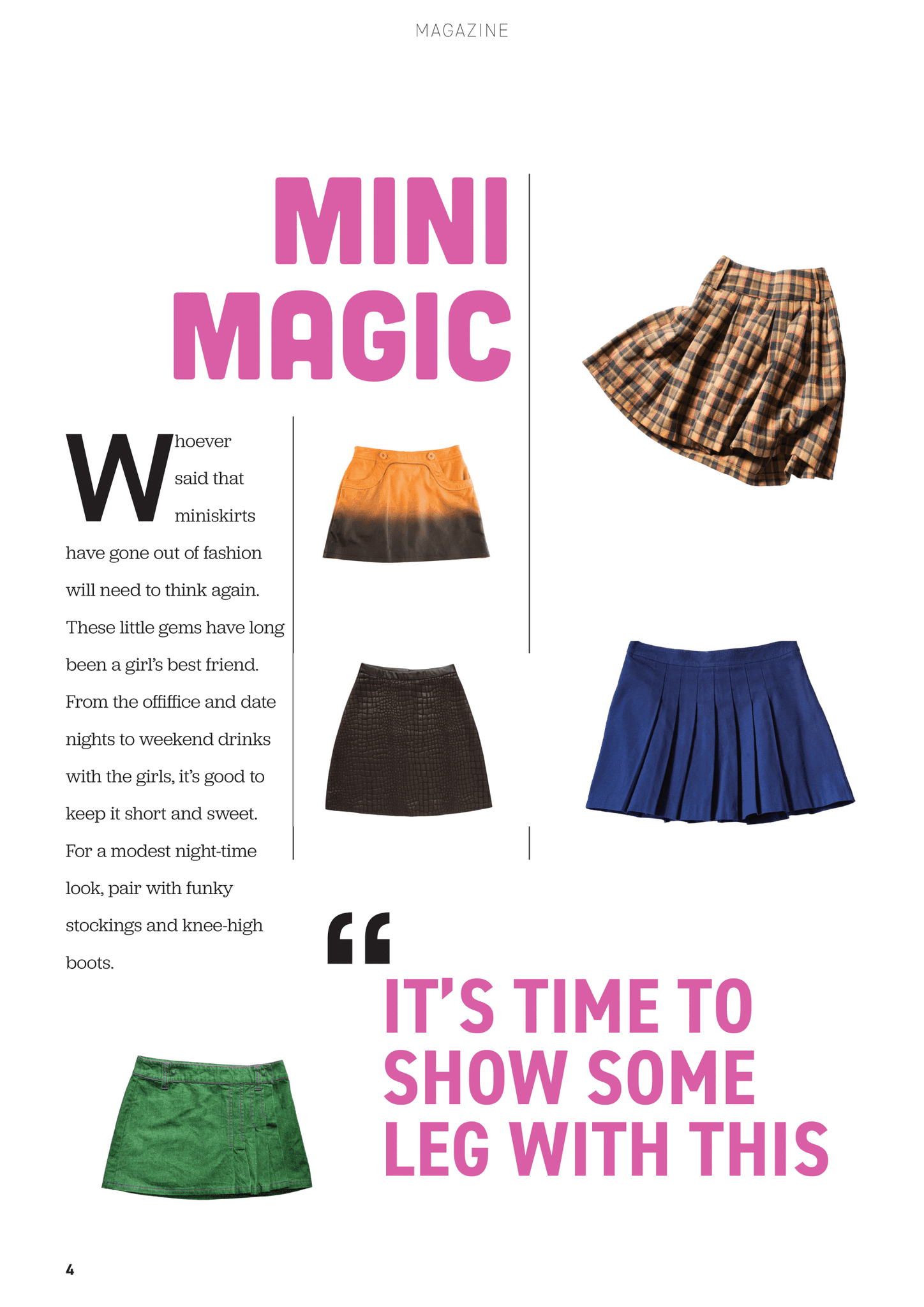
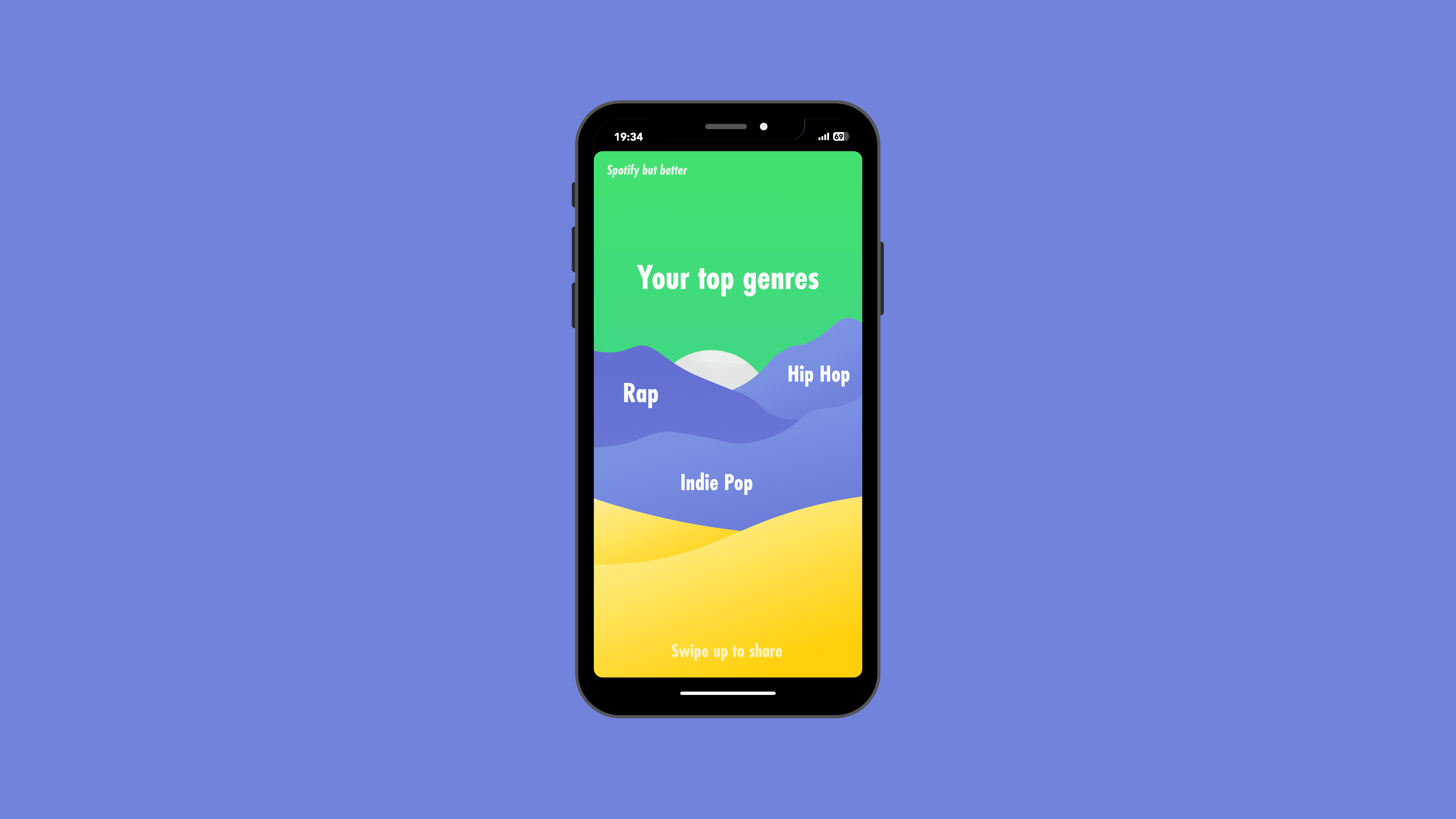
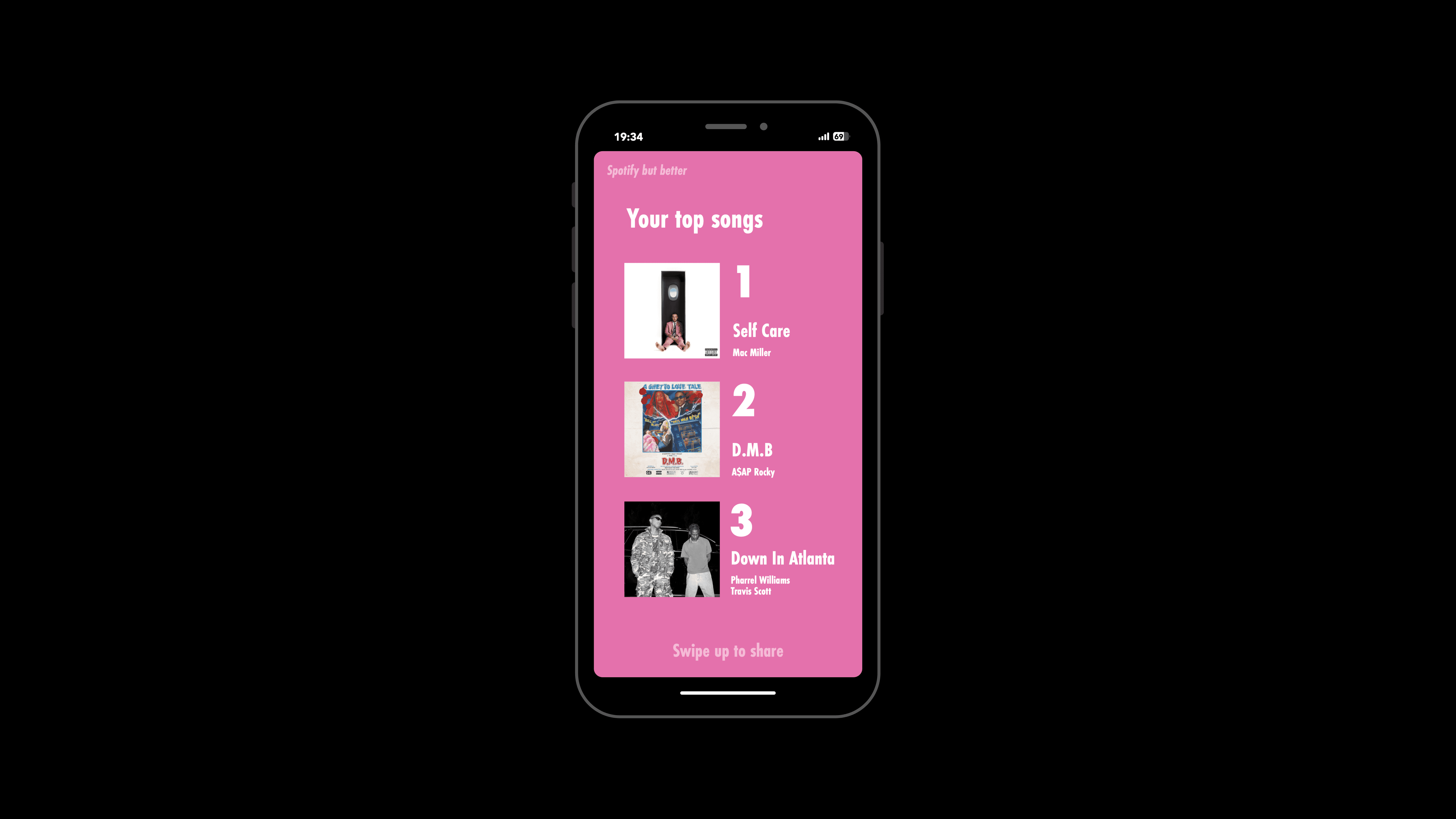
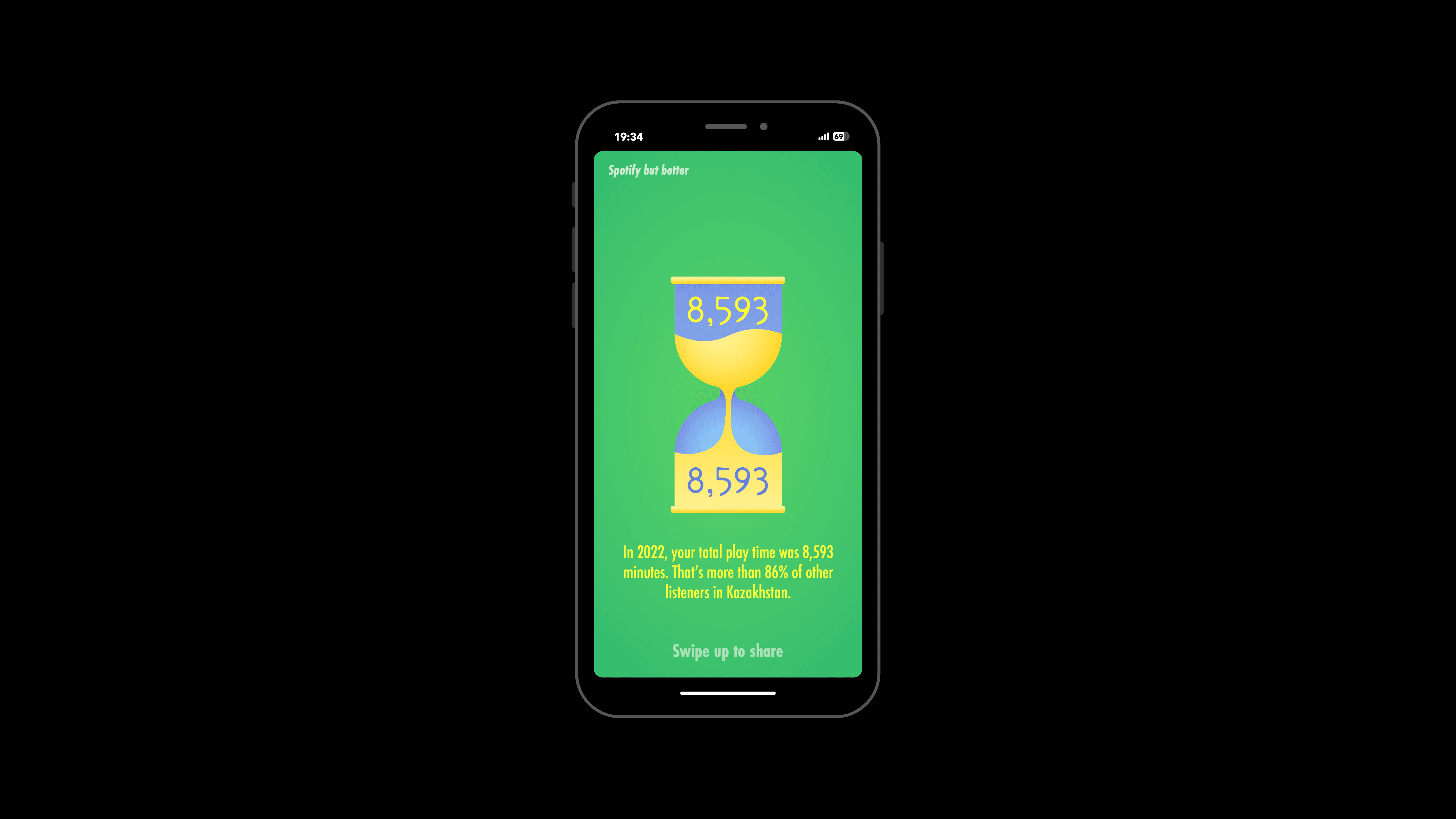
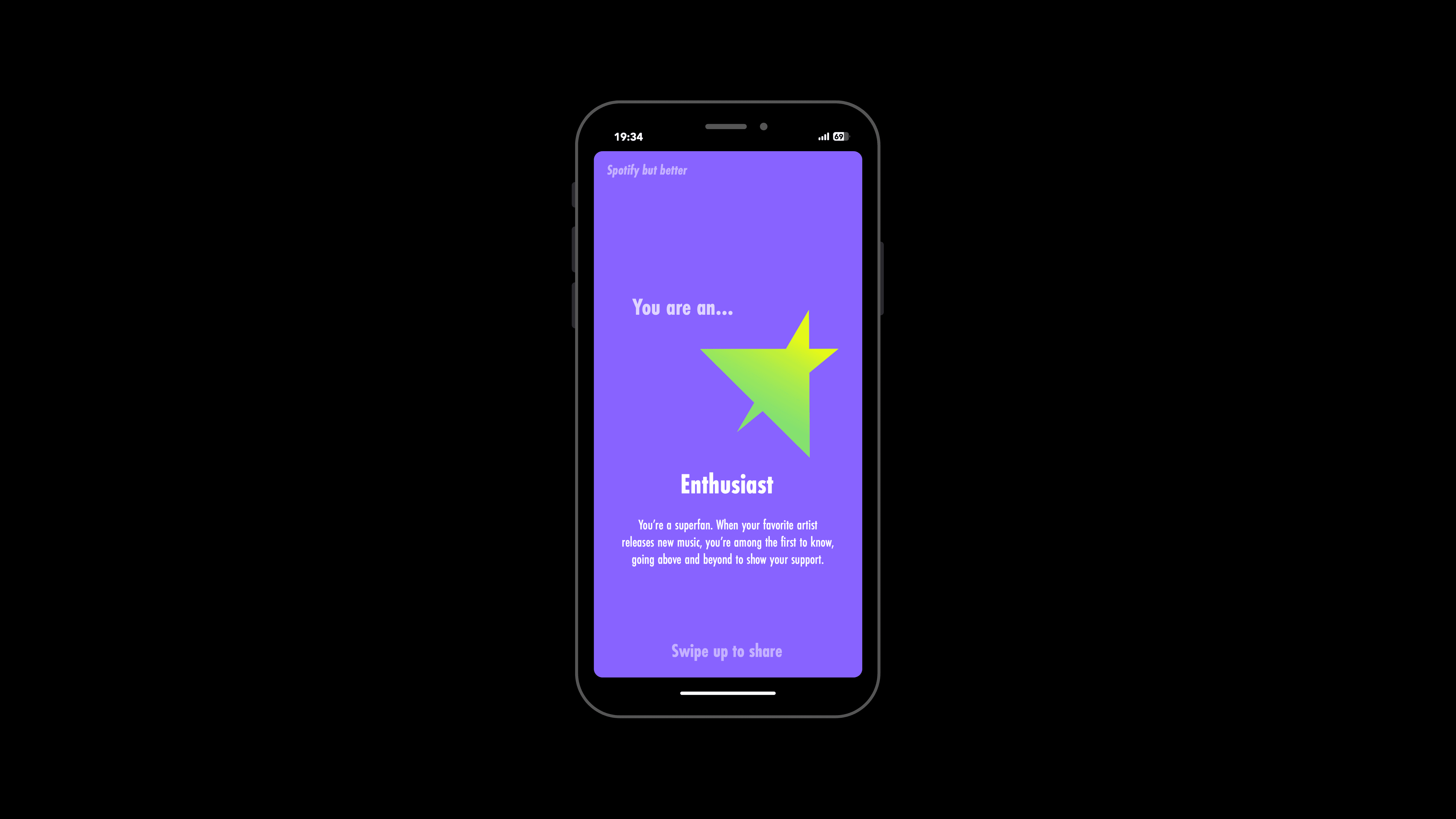
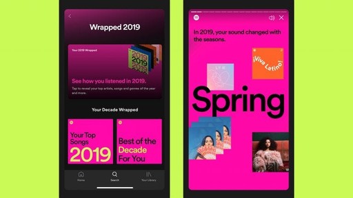
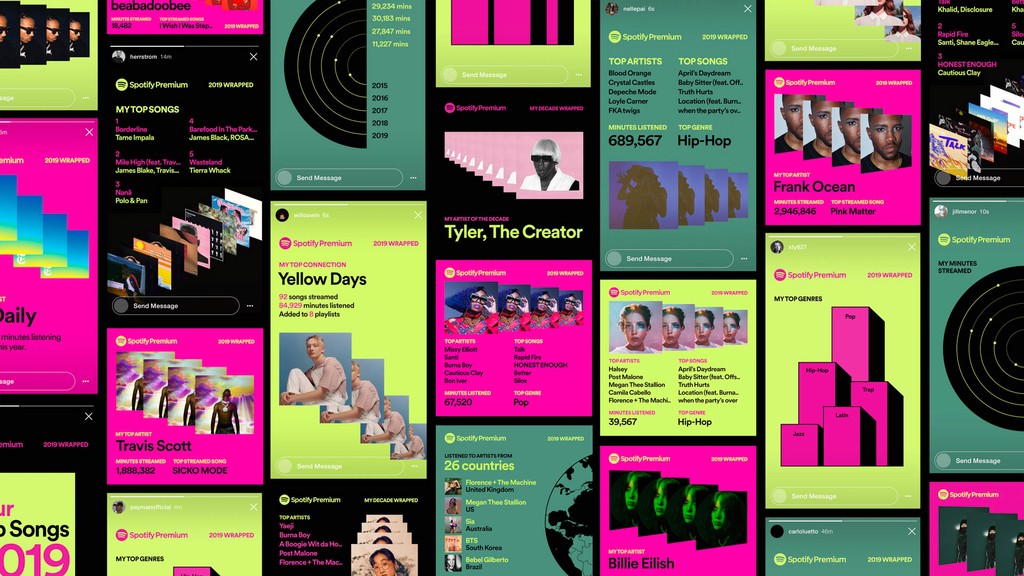
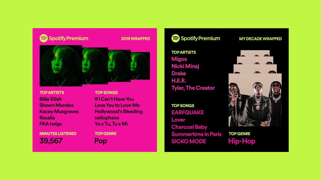
I chose to redesign Spotify Wrapped based on the overly complex and dark visual design themes it often employs, such as in the 2021 edition, which received mixed reactions. The original design, which had a chaotic look and darker, muted palettes, sometimes made it less appealing for social sharing. By contrast, my redesign introduces lighter, pastel colors and a cleaner, more minimal layout, making it more likely to be reshared on Instagram Stories. The goal was to simplify the visual storytelling while retaining the essence of personal music stats. Above you can see layouts from another project on magazine redesign made with similar tools.
Client
Services
Adobe Illustrator Adobe Photoshop Adobe InDesign
Industries
Graphic Design
Date
October 2022
Spotify offers personalized data, but the presentation tends to be uniform and focused on playlists and album covers. My design emphasizes user-specific content (genres, top songs) in a visually distinct way, with a clear hierarchical structure and engaging graphics. By centering personalization more prominently and visually, users are likely to feel more connected to their listening habits, enhancing user satisfaction and engagement with the platform.
